Problem
Car owners often face two disconnected challenges: keeping up with routine vehicle maintenance, and handling sudden roadside emergencies. Through observing Facebook community groups, I noticed a recurring pattern — drivers posting that they're stranded in a specific location, describing issues ranging from electrical faults and fuel shortages to flat tires and general mechanical breakdowns, hoping someone nearby can help. This revealed a clear gap: no reliable, structured way to get quick, relevant roadside assistance when it matters most.
Solution
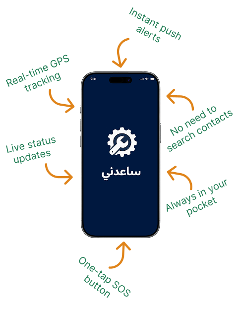
I decided to design Saedny, a car maintenance and emergency assistance app that lets users report their car issue with one tap, share their live location, and get connected to nearby help — while also tracking routine maintenance to prevent breakdowns before they happen.
What is Saedny ?
Saedny is a mobile app designed for car owners who want peace of mind on the road. It combines two essential needs into a single experience: keeping up with routine vehicle maintenance, and getting fast, reliable help when something goes wrong unexpectedly. Instead of juggling different tools — or relying on posting in Facebook groups and hoping a stranger nearby can help — users can log their car's maintenance history, get reminders before issues arise, and, if they do break down, send an emergency request with their live location in just a few taps.
Empathize
Understanding who are the users
My first thought was to develop a product that could help car owners handle both routine maintenance and unexpected roadside emergencies in one place. I decided to interview 2 groups of people:
Group 1
People whose car breaks down unexpectedly on the road and need fast emergency assistance
Group 2
People who want to keep up with their car's routine maintenance
Goals Interviewing Group 1
• Get to know their background (how often they drive, familiarity with car mechanics)
• Understand what they typically do when their car breaks down
• Understand their biggest frustration during an emergency
• Understand what would make them trust and use a help request from the app
Goals Interviewing Group 2
• Get to know their background (how often they service their car, where they usually go)
• Understand how they currently track maintenance (memory, notebook, nothing?)
• Understand their biggest frustration with current maintenance habits
• Understand what would motivate them to use an app for this
Define
Defining users, problems, and solution
The mobile application showed itself as the better option because:
To be sure that the mobile application would be the better option, I took note of the pros and cons of existing alternatives (Facebook groups, phone calls to mechanics/towing services, a website, and traditional roadside assistance hotlines).
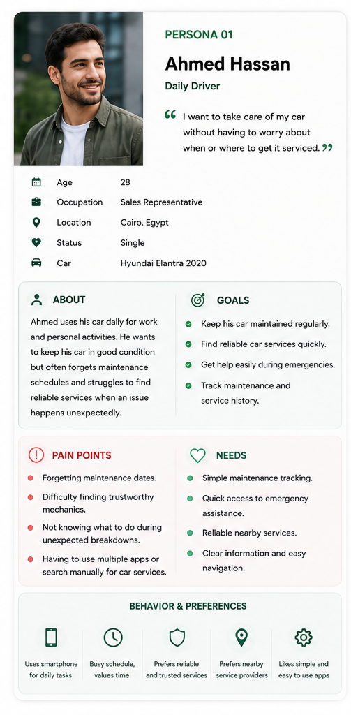
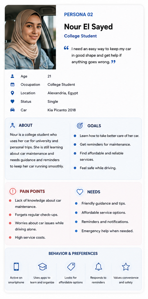
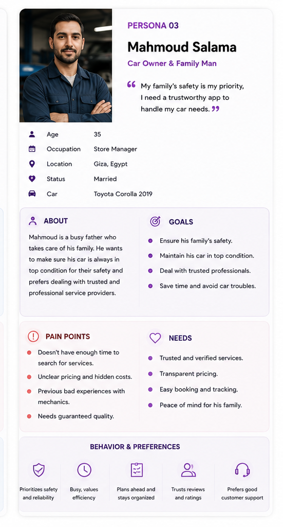
Engaging Personas
Trying to develop a product focused on users' needs, I translated all the insights gathered from the interviews and research into Engaging Personas. This way, the design and development process could stay grounded in who the app was actually being built for.
Ideate
To help me advance to the Ideation stage, I created some questions to make me think better about the personas' needs:
How Might We?
Emergency
How might we help drivers get fast, reliable roadside assistance without the uncertainty of asking strangers online?
Maintenance
How might we help car owners stay on top of routine maintenance without relying on memory or manual tracking?
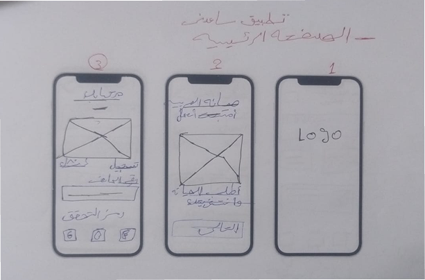
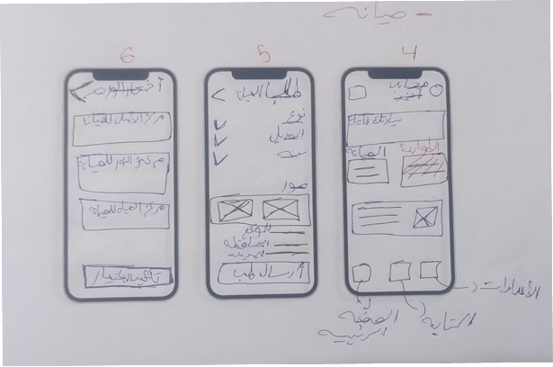
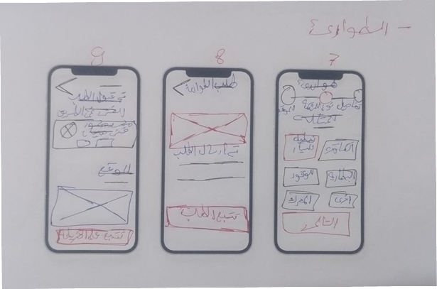
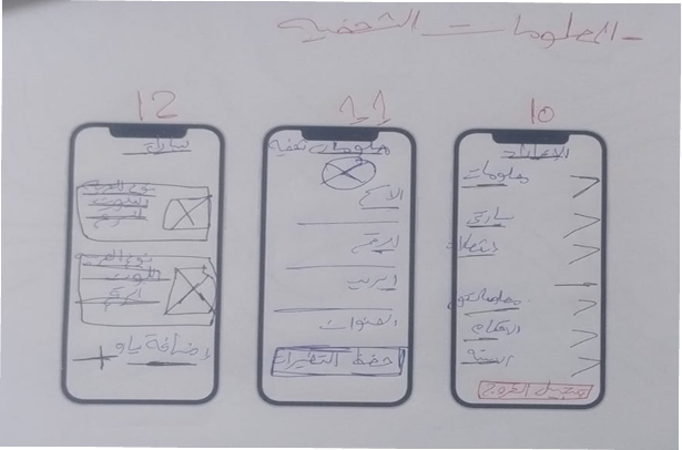
Paper Sketch
Before jumping into digital wireframes, I sketched out initial ideas on paper. This helped me quickly explore different layout options and screen flows without getting caught up in visual details too early.
User Flow
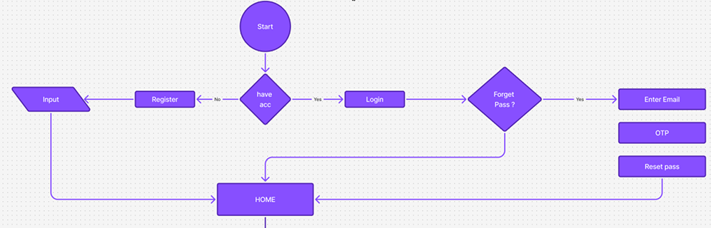
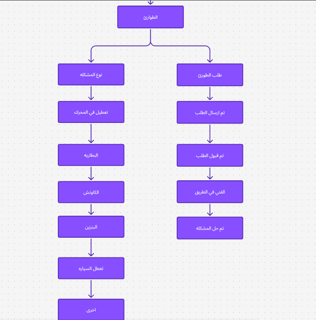
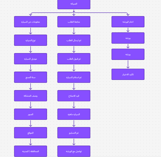
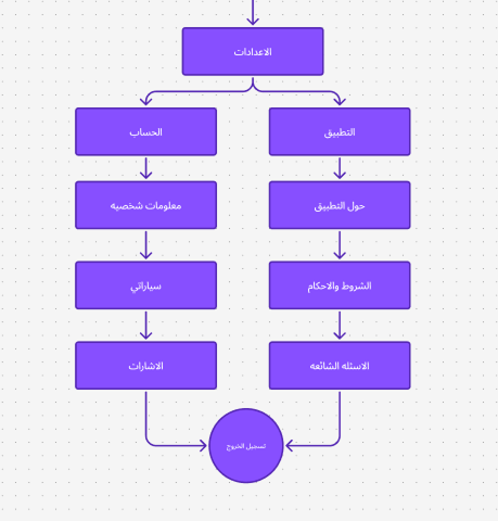
After sketching the initial ideas, I mapped out the user flow for each group to define the exact steps a user takes to complete their goal — from opening the app to receiving help or logging a maintenance record.
The Final Product
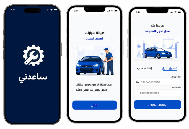
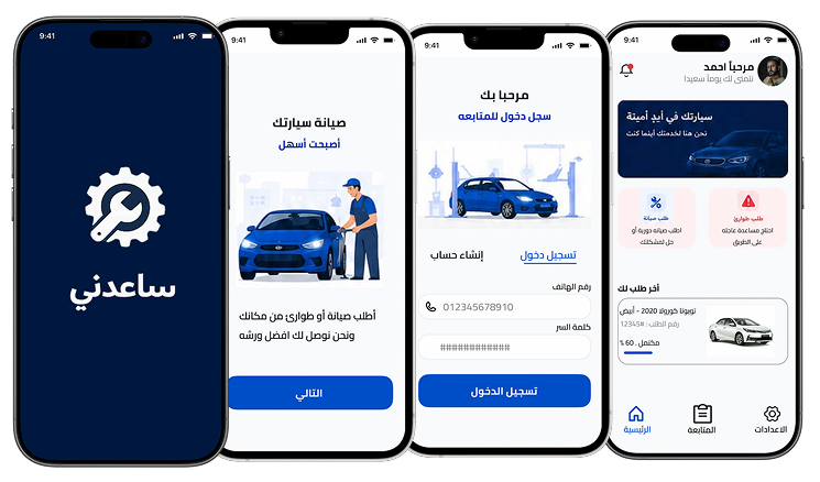
Login Screens
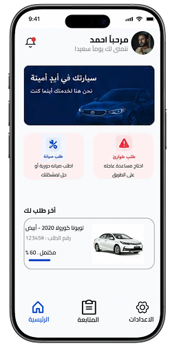
Home Page
The main dashboard the user lands on after logging in. It greets the user by name and reassures them their car is in safe hands. Two primary actions are immediately visible: requesting scheduled maintenance or requesting emergency roadside help — the app's two core use cases, placed side by side so the user never has to search for them. Below that, a "Latest Request" card shows the status of the user's most recent service, giving quick visibility into ongoing activity without navigating elsewhere. A bottom navigation bar (Home, Track, Settings) keeps core sections one tap away.
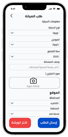
Maintenance Request Form
A structured form for booking routine maintenance. The user provides car information (type, model, year), a description of the issue, and can optionally attach photos for more context. Below that, the user selects their location (governorate and area) to help match them with a nearby workshop. Two clear actions close the flow: choosing a specific workshop, or submitting the request directly for the app to match one automatically.
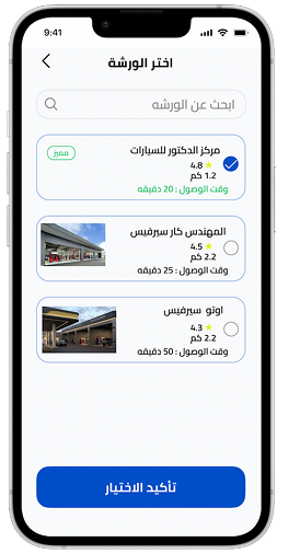
Choose Workshop
After submitting a maintenance request, the user can browse and select a workshop from a ranked list. Each option displays the workshop's name, rating, distance, and estimated arrival time — with a "Featured" badge highlighting top-rated options. This transparency lets the user make an informed choice instead of blindly trusting whoever responds first.
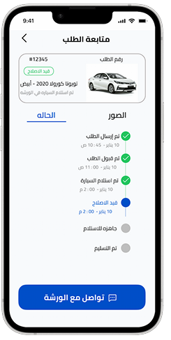
Request Tracking
A live status tracker for an ongoing maintenance request, showing the request number, car details, and current status. A vertical timeline breaks the process into clear milestones — Request Sent, Request Accepted, Car Received, In Repair, Ready for Pickup, Delivered — each timestamped. This gives the user full visibility into where their car stands at every stage. A "Contact Workshop" button offers a direct line of communication if needed.
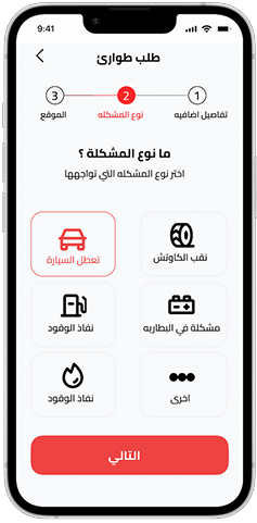
Emergency Request
Step 2 of 3 in the emergency request flow. The user selects the type of problem they're facing from six clear options: car breakdown, flat tire, out of fuel, low fuel, battery issue, or other. Each option uses a simple icon paired with a label so the user can identify their issue at a glance, even under stress. A progress indicator at the top shows exactly how many steps remain before the request is sent.
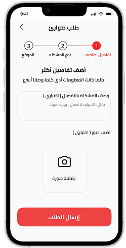
Emergency Request — Additional Details
The final step of the emergency request. The user can optionally add more context — a detailed description of the problem and photos — to help responders prepare before arriving. The messaging reinforces why this matters ("the more accurate the information, the faster we reach you"), encouraging users to share helpful detail without making it mandatory, so the flow stays fast even if they skip it.
What I've learned
• Splitting my research into two distinct user groups — emergency and maintenance — early on made it clear these were two different mental states with two different needs. Designing for both with a single generic flow would have failed either one.
• The biggest challenge was balancing speed with trust: users needed to act in seconds, but also needed to feel confident that whoever showed up was reliable. This shaped decisions like showing workshop ratings and live tracking instead of just a simple "help is coming" message.
• If I revisited this project, I'd want to validate these flows with real usability testing rather than research alone, to see how the designs actually hold up under real time pressure.