Al-Maktaba Al-Shamela — Redesign
Simplifying the reading experience through a modern redesign.

What is Al-Maktaba Al-Shamela?
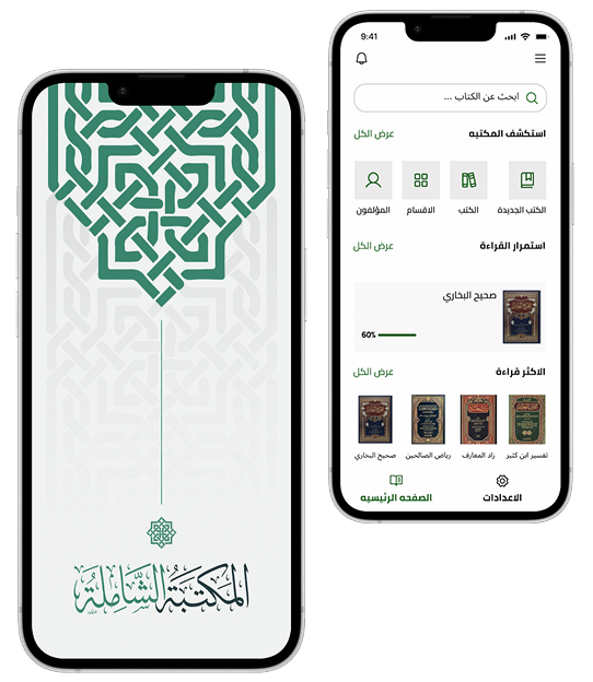
Al-Maktaba Al-Shamela is a mobile app that gives users access to a massive digital library of Islamic reference books — from Hadith collections to Fiqh and Tafsir texts — all searchable and downloadable in one place.
Usability Testing
I conducted a hands-on usability evaluation of Al-Maktaba Al-Shamela by using the app extensively myself, identifying friction points and usability issues firsthand, and evaluating them against common UX/UI heuristics before proposing improvements.
SWOT Analysis
To structure my findings from using the app, I ran a SWOT analysis — mapping out the Strengths, Weaknesses, and Opportunities I identified, and separating each point into UX, UI, or business-related issues.
Strengths
- A large and comprehensive collection of Islamic books and references
- Full support for Arabic and RTL layout
Weaknesses
- Lack of clear structure for the main app sections, causing confusion and poor navigation
- Absence of clear book details before opening (category, author, publication date), reducing decision-making efficiency
- Outdated, non-modern user interface, affecting overall visual experience
Opportunities
- Simplify the navigation structure by reducing it to core tabs, to reduce cognitive load
- Design a clear, structured Book Details page (category, author, publication date, download count)
- Enhance the overall UI with a modern, clean, minimal design system
Business Thinking — Pro Mode
Introducing a Pro subscription model to create a sustainable revenue stream for the app while offering additional value to users through exclusive premium features.
Notifications: Personalized updates and important announcements
Audio Reader: Listen to a chosen book or section read aloud
Early Access to New Books: Access newly added books before the free version
AI Assistant: Summarize books or pages and extract key insights
Empathize
Group 1
People who read for personal enrichment and daily reflection, without a specific book in mind.
Goals Interviewing Group 1:
- Get to know their background (reading habits, how often they use the app)
- Understand how they currently pick what to read
- Understand their biggest frustration with the current experience
- Understand what would make reading feel more seamless
Group 2
People who need to verify a specific reference or hadith for study or research purposes.
Goals Interviewing Group 2:
- Get to know their background (field of study, how often they verify references)
- Understand what they typically search for and how
- Understand their biggest frustration when trying to confirm a source
- Understand what would help them trust a result faster
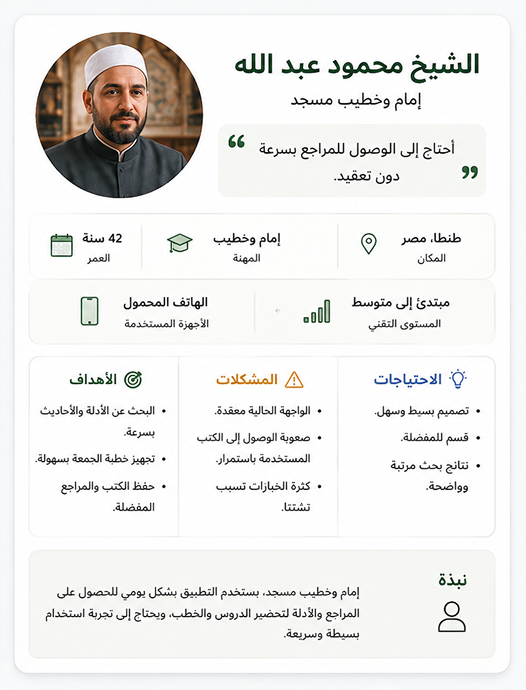
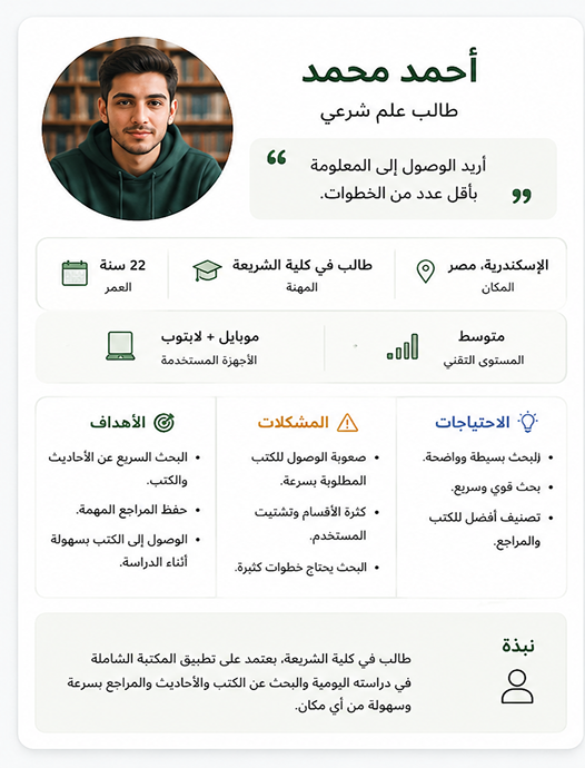
Persona
Based on the two user groups I identified, I built out personas to represent their goals and frustrations — giving the design process a clear person to design for, rather than an abstract "user."
User Flow
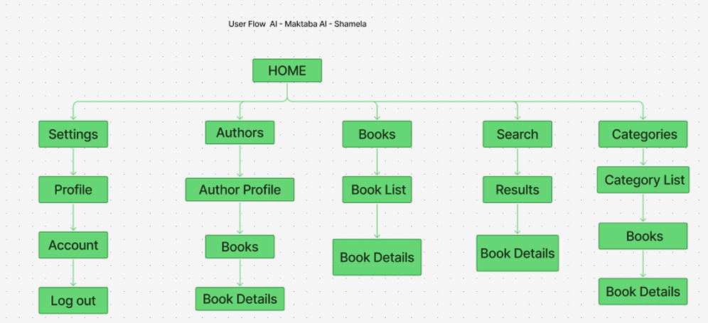
After sketching the initial ideas, I mapped out the user flow for each group to define the exact steps a user takes to complete their goal — from opening the app to finding, verifying, or resuming a book.
Final Design
Bringing together the research, personas, and sketches, here's the final redesign — a cleaner, more structured experience across the app's key screens.
1. Home Screen Redesign
Problem
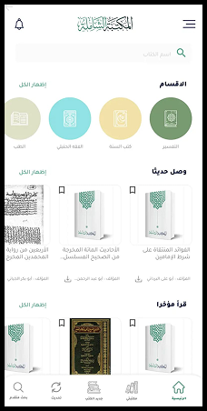
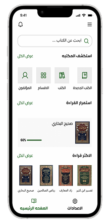
The original home screen relied on colored circular icons for categories with no clear visual hierarchy, and repeated the same generic book cover across multiple sections, making it hard to distinguish content or quickly find what the user was looking for.
Solution
I redesigned the home screen around clear entry points (Authors, Categories, Books, New Books) using simple line icons instead of colored circles, added a "Continue Reading" section with progress tracking, and introduced a "Most Read" row using real book covers.
My Role
My role here was information architecture and visual hierarchy: reorganizing the home screen so the most-used actions are immediately visible and cognitive load is reduced.
The Final Product
This final design is the result of extensive personal usability testing and analysis. I was able to solve most of the core issues I identified in the audit, while also introducing some new features inspired by well-designed reading and library apps.
2. Search Screen Redesign
Problem
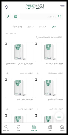
Finding a specific book meant scrolling through a long, dense alphabetical list with heavy visual repetition, and filtering options were cramped into small icon buttons with no labels.
Solution
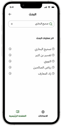
I introduced a dedicated search screen with recent search history, so users can quickly return to books or authors they've searched for before instead of re-typing or re-browsing every time.
My Role
I identified that most repeat usage was users searching for the same handful of books, and designed the UI layout around optimizing that specific user behavior.
The Final Product
This final design is the result of extensive personal usability testing and analysis. I was able to solve most of the core issues I identified in the audit, while also introducing some new features inspired by well-designed reading and library apps.
3. Book Details Screen Redesign
Problem
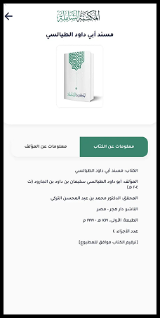
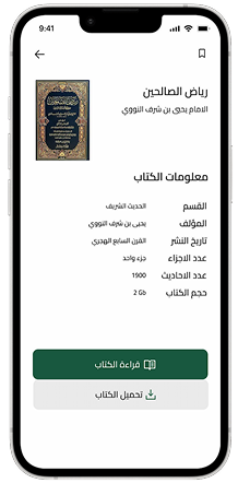
The original book detail page presented all information with equal visual weight and tight line spacing, making it hard to scan and prioritize what mattered most.
Solution
I restructured the page with a clear title/author hierarchy at the top, grouped supporting details into a scannable list with generous spacing, and made "Read" and "Download" the two primary actions with strong visual contrast.
My Role
This was primarily a typography and visual hierarchy fix — deciding what deserves emphasis versus what's secondary to streamline user decision-making.
The Final Product
This final design is the result of extensive personal usability testing and analysis. I was able to solve most of the core issues I identified in the audit, while also introducing some new features inspired by well-designed reading and library apps.
4. Settings Screen Redesign
Problem
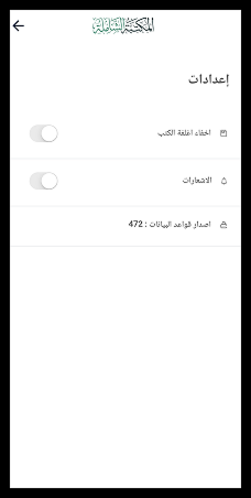
The original settings screen was extremely limited — just two toggle switches and a database version number, with no personalization options at all.
Solution
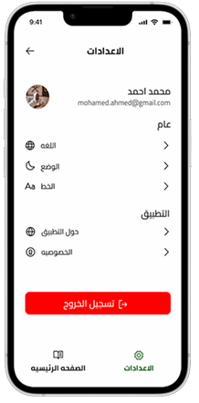
I redesigned the settings screen around a proper user profile at the top, then grouped options into clear sections — General (Language, Dark Mode, Font) and App (About, Privacy) — giving users real control over their reading experience.
My Role
This directly addressed one of the core Weaknesses flagged in my UX audit regarding limited customization, establishing a complete user preferences architecture.
The Final Product
This final design is the result of extensive personal usability testing and analysis. I was able to solve most of the core issues I identified in the audit, while also introducing some new features inspired by well-designed reading and library apps.
What I've Learned
1. Real usability issues come from real use, not assumptions
Auditing an app I actually use daily taught me that the most valuable UX insights don't come from guessing what users need — they come from paying close attention to your own friction points as a real user.
2. Small structural fixes have outsized impact
Fixes like reorganizing the settings screen or restructuring the book details page seemed minor at first, but they directly addressed the weaknesses that were most frustrating in daily use.
3. What I'd do differently
If I revisited this project, I'd want to test the redesigned flows with other real users beyond myself, to validate whether the changes actually improve their experience the way I intended.