Smile Bright — Dental Clinic Landing Page
A modern landing page designed for a dental clinic.
What is a Dental Clinic Landing Page?
A dental clinic landing page is a single-purpose web page designed to convert visitors into patients — showcasing the clinic's services, team, and credibility in one focused scroll, with clear calls-to-action guiding them toward booking an appointment.
Target Audience
People searching for a trustworthy dental clinic — likely comparing multiple options online — who need enough information (services, team credentials, patient reviews) to feel confident booking without visiting in person first.
What is the primary goal?
To increase appointment bookings by building trust quickly and making the next step (schedule a call / view services) impossible to miss.
Paper Sketch
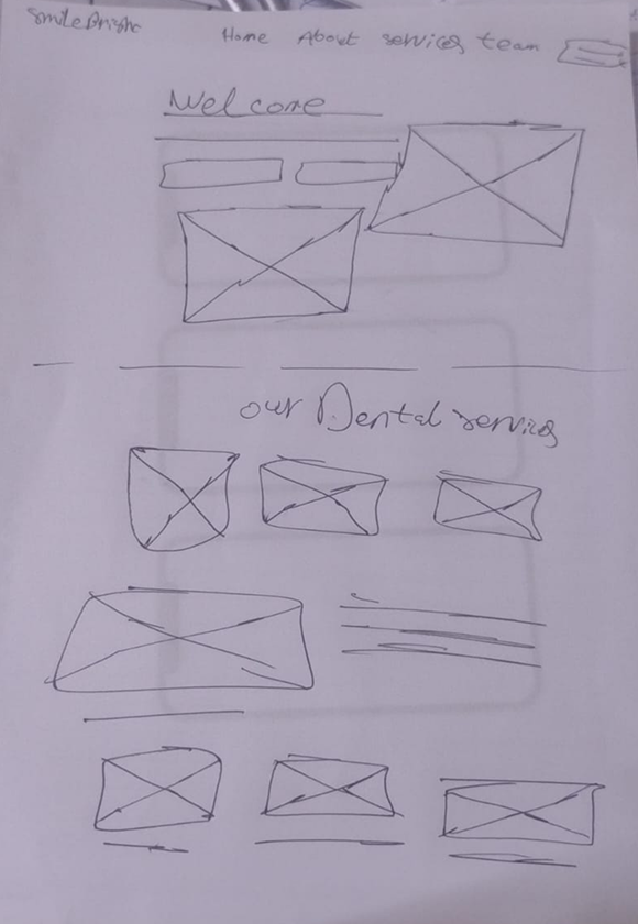
Before jumping into digital wireframes, I sketched out the initial layout on paper — starting with the navigation bar and hero section (Welcome message, two images), followed by the "Our Dental Services" section with three service cards, and a supporting section pairing an image with descriptive text. This helped me quickly test the page structure and content flow before touching Figma.
Wireframe
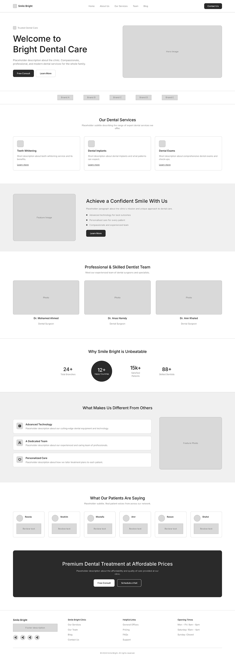
Building on the paper sketch, I created a full low-fidelity wireframe in Figma covering the complete page structure — from the hero section and services grid, through the team showcase and trust-building stats, to testimonials and a final call-to-action before the footer. This let me finalize content hierarchy and spacing decisions before applying any visual styling.
The Final Product
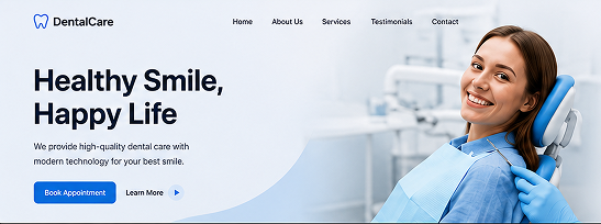
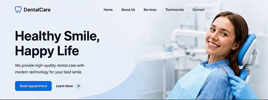
Bringing together the sketch and wireframe, here's the final high-fidelity design — a clean, blue-and-white landing page that builds trust through real team photos, clear service cards, and social proof (patient testimonials and brand logos), guiding visitors toward booking a call or exploring services at every key moment on the page.

What I've learned
1. A landing page is judged by one action, not many
Unlike an app with multiple user flows, a landing page succeeds or fails on a single metric: did the visitor take the action? This shifted how I thought about every section — each one had to either build trust or push toward booking, with nothing in between.
2. Repetition of CTAs isn't redundant — it's intentional
Repeating "Free Consult" and "Schedule a Call" at multiple points on the page felt repetitive at first, but it reflects how visitors actually scroll — they don't always reach the bottom, so the action needs to be reachable wherever they stop.
3. What I'd do differently
If I revisited this project, I'd want to A/B test different hero headlines and CTA placements to see which combination actually drives more bookings, rather than relying on design best practices alone.