Portfolio Website — Personal UX/UI Case Study
A UX/UI portfolio built with the same process as everything inside it.
What is Case Study UX/UI?
While building my portfolio, I decided to treat it as a real design project rather than just a container for my other work. So I went through the same process I use for any client project — research, sketching, wireframing — before designing and building the final site.
What is the primary goal?
Most portfolios are static — a PDF or a scroll of images with no real interaction. My goal was to build a portfolio that reflects how I actually work: structured, research-driven, and easy for recruiters to navigate and understand quickly.
Target Audience
Recruiters, hiring managers, and senior designers evaluating my work — people who need to quickly understand my process and skill level without digging through scattered files or links.
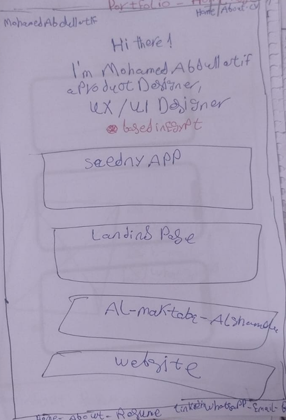
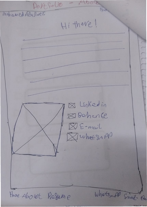
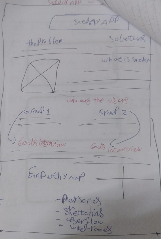
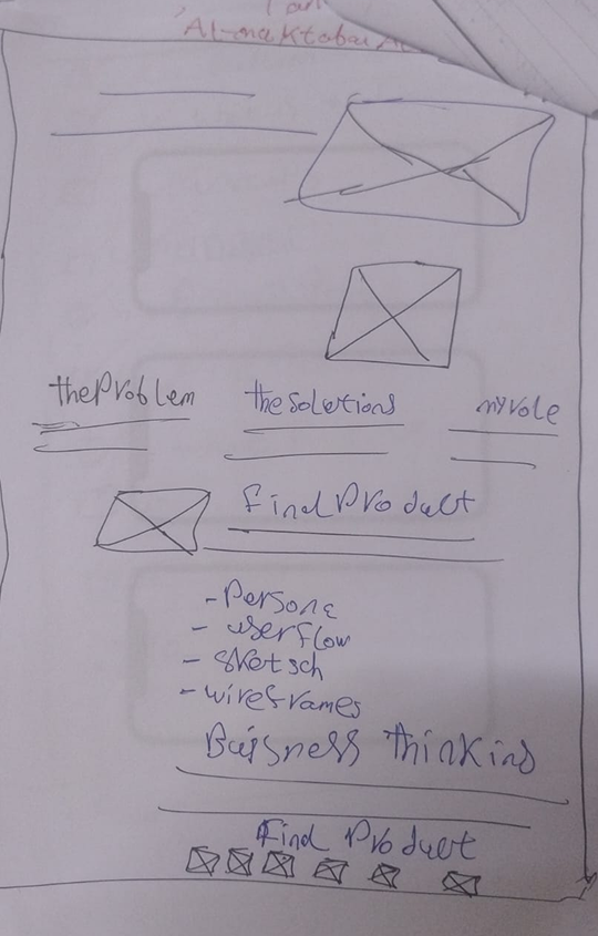
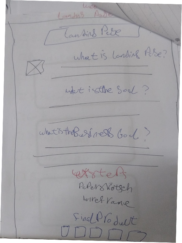
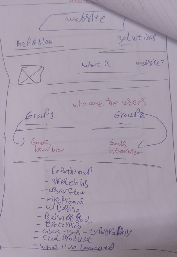
Paper Sketch
Before jumping into digital wireframes, I sketched out the homepage layout on paper — starting with a personal introduction (name, role, location), followed by cards for each project in the portfolio, and ending with contact links (LinkedIn, Behance, Email, WhatsApp) and simple navigation (Home, About, Resume). This helped me quickly test how to introduce myself and lead visitors into my work before touching Figma.
User Flow
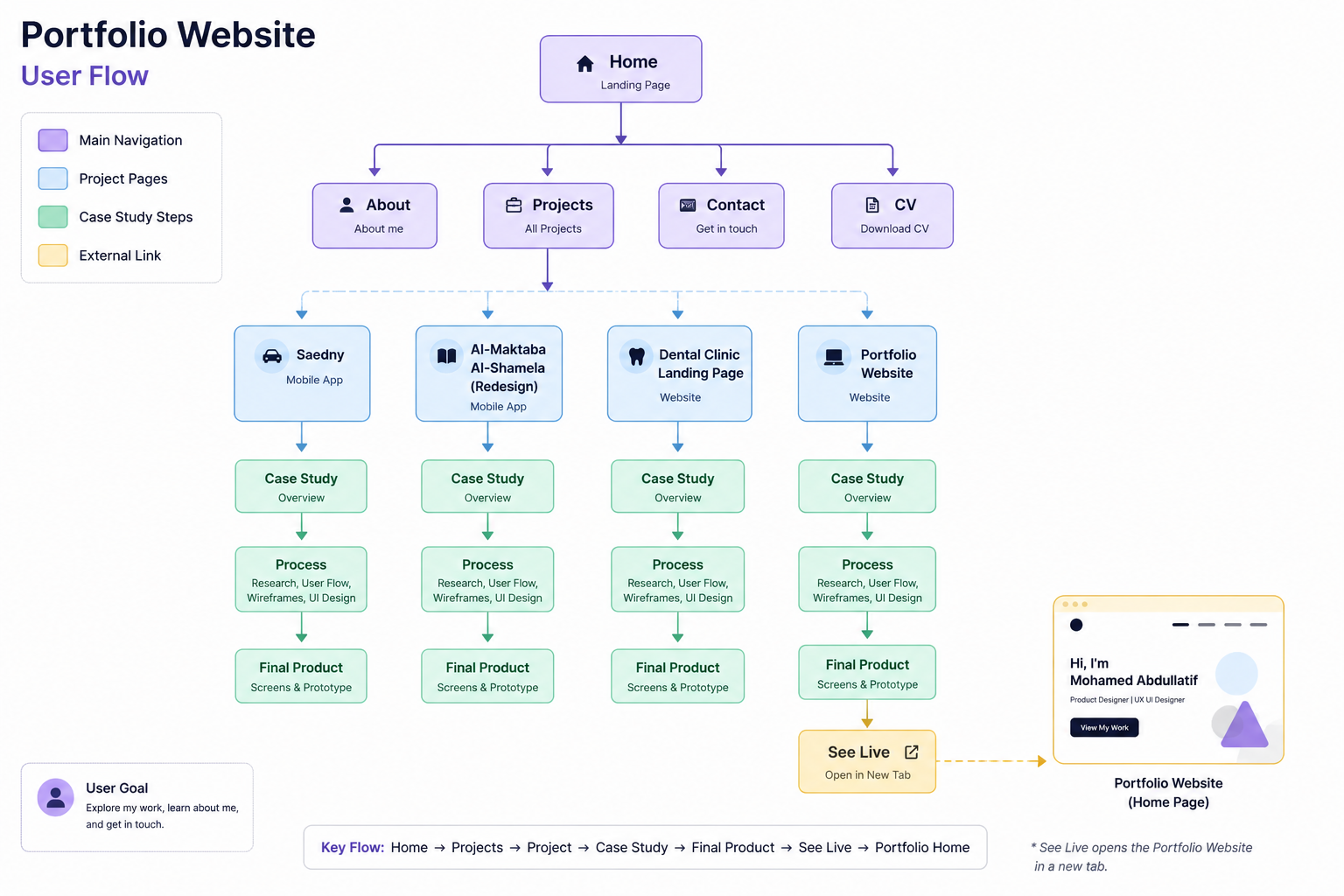
I mapped out the full navigation flow starting from the Home page, branching into the main sections (About, Projects, Contact, CV), then into each individual project. Every project follows the same consistent path — Case Study Overview, Process (Research, User Flow, Wireframes, UI Design), and Final Product — before optionally linking out to a live version. This consistency means visitors always know what to expect, no matter which project they open.
Final Product
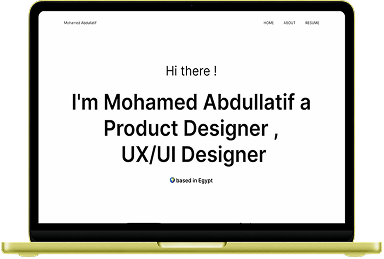
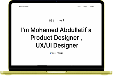
You don't need a mockup to see the final product — you're already using it. This portfolio is the final design, live and interactive, not a static preview.
See It Live